Font Pairing
Color Tool
Logo Maker
Favicon Maker
Design Principles
Branding Guide
Best UX Practices
Anti Design UI Patterns
  1. Introduction to Design Principles

    • Purpose of Design Principles: Understand how design principles serve as the foundation for creating aesthetically pleasing and functionally effective visual communications.
    • Role of Design in Viewer Perception: Discover how proper design influences how information is perceived and processed by viewers.
    • Natural Attraction to Proportion and Balance: Explore the human inclination to prefer visuals that exhibit balance, symmetry, and proportion, enhancing the overall appeal of designs.
    • Importance of Cohesion in Design: Learn why cohesive design elements lead to more understandable and effective communication in visual arts.
  2. Core Concepts of Design Principles

    • Definition and Importance: Unpack how design principles help structure the visual elements of any project to improve comprehension and aesthetic quality.
    • Universal Application: Examine how these principles apply universally across different forms of design, from graphic design to industrial design.
    • Guidance for New Designers: Gain insights into how budding designers can use these principles as a roadmap to refine their work.
    • Evolution of Design Norms: Understand how these principles adapt and evolve within the dynamic field of design, accommodating new trends and technologies.
  3. The 12 Principles of Design

    • Emphasis and Focus: Techniques to draw attention to key elements of your design, enhancing the storytelling aspect of visuals.
    • Balancing Elements: Strategies to distribute visual weight evenly or asymmetrically to achieve desired visual effects.
    • Contrasting for Impact: Utilize contrast to make elements stand out, using color, shape, and size differences to highlight important features.
    • Repetition for Unity: Implement repeated motifs or elements to establish a sense of unity and consistency across the design.
    • Proportionality in Design: Adjust the scale of visual elements relative to each other to maintain harmony and balance.
    • Guiding with Movement: Direct the viewer's eye path through strategic layout and positioning of elements.
    • Effective Use of White Space: Employ negative space to enhance readability and focus, and to create a clean, uncluttered look.
    • Creating Rhythm: Develop a visual rhythm through repeating elements that enhance the viewer's experience and engagement.
    • Pattern Recognition: Incorporate recognizable patterns to create familiarity and add depth to your designs.
    • Establishing Hierarchy: Organize information according to its importance using size, color, and placement to guide the viewer's attention.
    • Incorporating Variety: Introduce variations in design elements to keep the content dynamic and engaging.
    • Achieving Unity: Ensure all components work together to form a coherent whole, reflecting a consistent style and message.
  4. Designing with Principles

    • Balancing Creativity and Rules: Learn to balance artistic freedom with the structured approach provided by design principles.
    • Innovative Application: Encourage innovative uses of these principles to push the boundaries of conventional design.
    • Feedback and Adaptation: Emphasize the importance of gathering feedback and adapting designs based on viewer perception and interaction.
    • Real-World Testing:Highlight the necessity of testing designs in real-world scenarios to ensure they achieve their communication goals effectively.
  5. Practical Design FAQs

    • Understanding Effective Elements: Discuss the most visually effective elements in design and their psychological impacts.
    • Exploring Strong Design Foundations: Delve into why certain principles like balance are fundamental in any good design.
    • Adapting Principles Across Media: Address how to adapt these principles effectively across different media, from digital to print.
    • Common Design Challenges: Provide solutions to common design challenges and questions about integrating multiple principles.
  6. Conclusion: Implementing Design Principles

    • Professional Excellence Through Principles: Stress how adherence to these principles can elevate professional design work to excellence.
    • Continuous Learning and Adaptation: Encourage ongoing learning and adaptation to new design trends and technologies.
    • Creative Expression and Standards: Balance creative expression with the need to meet established design standards.
    • Toolkit for Success: Offer these principles as a toolkit for designers to craft visually compelling and effective designs.
  7. Call to Action: Ready to Design Your Logo?

    • Interactive Logo Design Tool: Prompt users to engage directly by trying out an online tool to design their own logos.
    • User-Centric Design Experience: Highlight the user-friendly aspects of the tool, ensuring anyone can design a professional-looking logo.
    • Creative Freedom: Empower users with the freedom to experiment with different design principles in real-time.
    • Instant Professional Results: Assure users of achieving professional-grade results with easy-to-use features and guidance.
  1. Understanding UX for Web Development

    • What is UX? Explore the significance of User Experience in enhancing functionality and enjoyment for users of your website or app.
    • Why UX Matters: UX matters because it directly impacts how users perceive and interact with a product or service, influencing their satisfaction, loyalty, and ultimately the success of the business.
    • Key Elements of UX: Familiarize yourself with fundamental UX components like usability, accessibility, and user feedback, which are essential for a positive user experience.
    • Continuous Improvement: Embrace the iterative nature of UX design by continuously seeking user feedback and making improvements to enhance usability and satisfaction.
  2. Principles of Effective UX Design

    • User Understanding: Build user personas and conduct regular usability testing to tailor your designs to the actual needs and behaviors of your audience.
    • Usability Basics: Create an intuitive user interface where navigation is straightforward and all elements are easily accessible to enhance user interactions.
    • Accessibility for All: Implement accessibility features following the WCAG guidelines by providing text alternatives for non-text content, ensuring keyboard accessibility, and using accessible color contrasts to cater to users with disabilities.
    • Consistent Experience: Ensure your website maintains consistent design patterns, typography, and color schemes across all pages and interactions to make the user experience predictable and reliable.
  3. Best UX Practices for Web Developers

    • Conduct User Research: Employ tools like surveys, interviews, and analytics to deeply understand user preferences and improve design decisions.
    • Wireframing & Prototyping: Utilize wireframes and prototypes to visualize and test design concepts early, allowing for adjustments before full-scale development.
    • Design for Mobile-First: Prioritize mobile design to ensure optimal functionality and appearance on mobile devices, given their prevalence among users today.
    • Optimize for Performance: Focus on enhancing site speed by optimizing images, leveraging browser caching, and minimizing code to improve user engagement and SEO.
  4. Advanced Tips for Enhancing UX

    • Effective Color Choices: Select colors that align with your brand identity and are psychologically appealing to your audience to enhance user engagement and emotional response.
    • Smart Typography: Choose readable and aesthetically pleasing fonts that complement your design and improve content readability.
    • Visual Hierarchy Techniques: Employ visual hierarchy principles using size, color, and layout to draw attention to key elements and improve content navigation.
    • Navigation and Forms: Design simple and clear forms and navigation paths to minimize user effort and maximize efficiency, thereby increasing user completion rates and satisfaction.
  5. Leveraging Tools and Resources

    • Popular UX Tools: Integrate UX tools like Sketch, Figma, and Adobe XD into your design process to enhance design efficiency and collaboration.
    • Continuous Learning Opportunities: Engage with online courses, webinars, and UX communities to keep your UX knowledge and skills current and effective.
    • Best Practices for Workflow: Seamlessly incorporate UX design into your development workflow to ensure all team members are aligned and user-centered decisions guide development.
    • Feedback and Iteration: Regularly test your designs with users, gather feedback, and iteratively refine your UX to ensure it remains effective and relevant.
  6. Conclusion: The Importance of UX in Web Development

    • Broaden Your Impact: Recognize how robust UX practices can not only satisfy users but also significantly contribute to your project's success.
    • Encourage Collaboration: Highlight the benefits of teamwork between designers, developers, and stakeholders to create cohesive and powerful user experiences.
    • Stay Informed: Stay abreast of emerging UX trends and technologies to ensure your projects are innovative and competitive.

Select the best font pairs that look good together for your project.

Create a business name and logo for your business brand

Convert your images to favicon files

Upload your favicon and we will make favicon asset package. Copy the text in instructions to the top of your html site.

or

Place the converted files in the root directory of your website. Then, copy the following link tags and paste them into the head of your HTML.

Palettes
Color Wheel
Color Converter

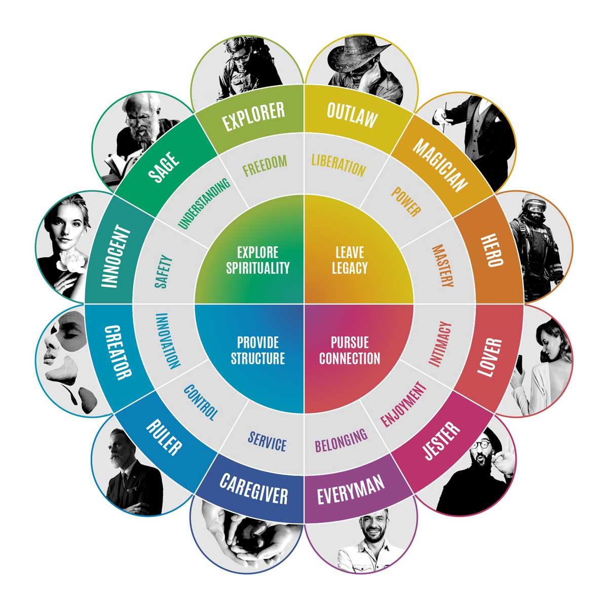
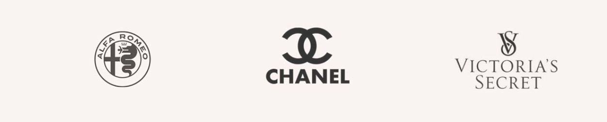
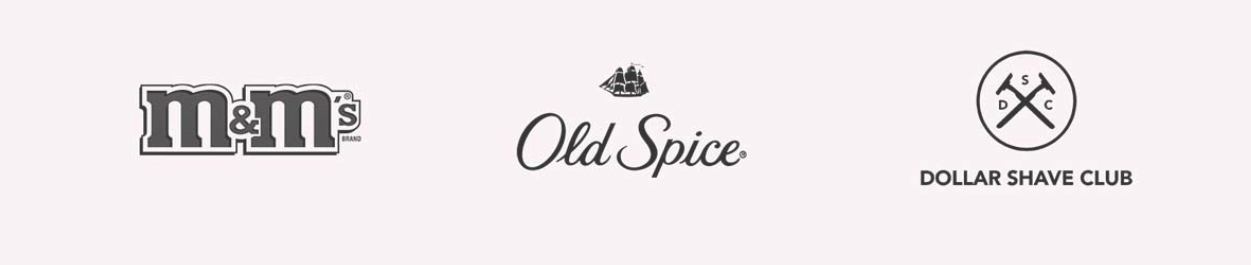
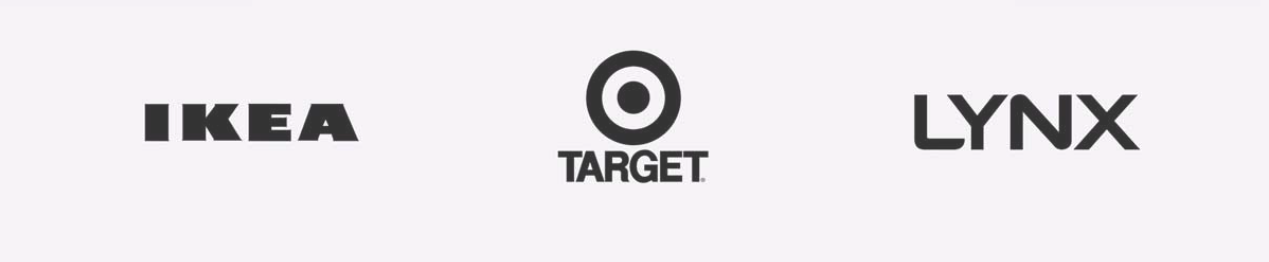
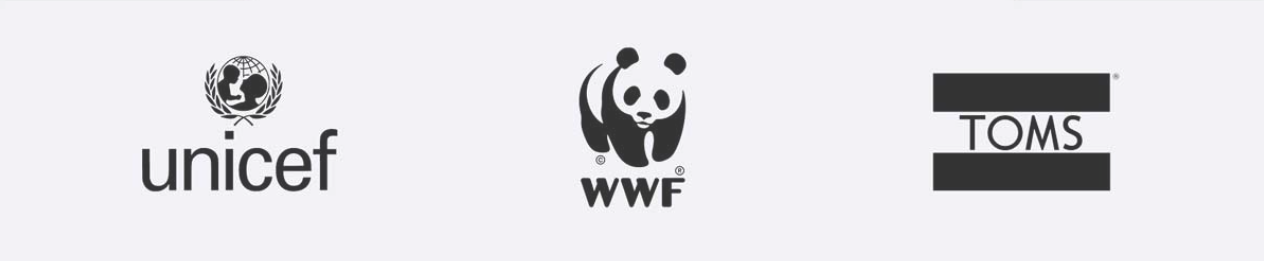
Archetypes in branding: The world's most loved brand all have personalities that we have a human connection with and they are developed on the framework called Brand Archetypes.

Branding Guide
  1. The Outlaw Archetype

    • Brand Voice: Disruptive, Rebellious, Combative
    • Brand Message: You don't have to settle for status quo. First, demand more, second, go out and get it.
    • Industries and Categories: Automobiles (motorcycles), Destruction tools, Alternative apparel, Body art

    Color Palette Example:

    #b15e39
    #faf6eb
    #55250d
    #a56f40
    #efd494

    Brands that use this archetype:

    Branding Guide
  2. The Magician Archetype

    • Brand Voice: Mystical, Informed, Reassuring
    • Brand Message: Tomorrow is better than today and al your dreams can come true if you believe.
    • Industries and Categories: Entertainment, Beauty, Relaxation/Well-Being, Health

    Color Palette Example:

    #0070b5
    #49b7e9
    #8681e8
    #fe89be
    #fd4431

    Brands that use this archetype:

    Branding Guide
  3. The Hero Archetype

    • Brand Voice: Honest, Candid, Brave
    • Brand Message: RWe can make the world better. We have the grit and determination to outwork the rest.
    • Industries and Categories: Sportswear, Sports Equipment, Outdoor/Tactical Equipment, Emergency Services

    Color Palette Example:

    #0e0d13
    #2b2d41
    #ffffff
    #c2bcc1
    #cc3e2f

    Brands that use this archetype:

    Branding Guide
  4. The Lover Archetype

    • Brand Voice: Sensual, Empathetic, Soothing
    • Brand Message: Your striking beauty is impossible to ignore.
    • Industries and Categories: Fragrance, Cosmetics, Wine, Indulgent Food, Indulgent Travel

    Color Palette Example:

    #588a4f
    #7aa571
    #818c9e
    #ab3941
    #68181c

    Brands that use this archetype:

    Branding Guide
  5. The Jester Archetype

    • Brand Voice:Fun Loving, Playful, Optimistic
    • Brand Message:We're here for a short time, not for a long time. Let your hair down and start living life.
    • Industries and Categories: Confectionery, Professional Services, Beer/Lager, Child Services

    Color Palette Example:

    #ff9800
    #cddc39
    #03a9f4
    #e91e63
    #ffeb3b

    Brands that use this archetype:

    Branding Guide
  6. The Everyman Archetype

    • Brand Voice:Friendly, Humble, Authentic
    • Brand Message: When we treat each other with honesty and friendliness we can ive together in harmony.
    • Industries and Categories: Home/Family Life, Comfort Foods, Everyday Apparel, Family Automobiles

    Color Palette Example:

    #85bdf8
    #2b3a96
    #9593a7
    #91bd7a
    #a38d71

    Brands that use this archetype:

    Branding Guide
  7. The Caregiver Archetype

    • Brand Voice:Caring, Warm, Reassuring
    • Brand Message:Everyone deserves care and we must all strive to bestow service upon one another.
    • Industries and Categories: Health & Aged Care, Not-for-profits, Hospitals, Education

    Color Palette Example:

    #5b6979
    #a1b1c2
    #ffffff
    #0192d3
    #2c7d78

    Brands that use this archetype:

    Branding Guide
  8. The Ruler Archetype

    • Brand Voice:Commanding, Refined, Articulate
    • Brand Message: You are successful in work and in life. Reward your excellence and achievements.
    • Industries and Categories: Luxury Automobiles, High-End Watches, Hotels, Formal Apparel

    Color Palette Example:

    #4e5e6b
    #0a1117
    #20404b
    #3a757e
    #7d0c10

    Brands that use this archetype:

    Branding Guide
  9. The Creator Archetype

    • Brand Voice:Inspirational, Daring, Provocative
    • Brand Message: See potential everywhere and uncover originality with liberated imagination.
    • Industries and Categories: Arts, Design, IT, Marketing, Writing

    Color Palette Example:

    #b6019a
    #ffffff
    #e10209
    #1b1715
    #f9ed06

    Brands that use this archetype:

    Branding Guide
  10. The Innocent Archetype

    • Brand Voice: Optimistic, Honest, Humble
    • Brand Message:The most wholesome things in life are unadulterated and pure.
    • Industries and Categories: Beauty & Skin, Organic, Cleaning, Fresh Food

    Color Palette Example:

    #eae1dc
    #a08b7a
    #ffffff
    #249e48
    #1123aa

    Brands that use this archetype:

    Branding Guide
  11. The Sage Archetype

    • Brand Voice: Knowledgeable, Assured, Guiding
    • Brand Message: Education is the path to wisdom and wisdom is where the answers lie.
    • Industries and Categories: Media & News, Education, Consultancies, Search Engines

    Color Palette Example:

    #a28761
    #86725d
    #f4f1ed
    #bbbda0
    #2d4900

    Brands that use this archetype:

    Branding Guide
  12. The Explorer Archetype

    • Brand Voice: Exciting, Fearless, Daring
    • Brand Message: You only get one life. Get out and make it count.
    • Industries and Categories: Extreme Sports, Outdoor Equipment, SUV Automobiles, Adventure Travel

    Color Palette Example:

    #d5c6af
    #906c46
    #ffffff
    #696812
    #212809

    Brands that use this archetype:

    Branding Guide

Understanding UI anti-patterns is crucial for effective web design. This guide highlights common pitfalls to avoid.

  1. Ambiguous Link Labeling

    Ambiguous Link Labeling example from UX article

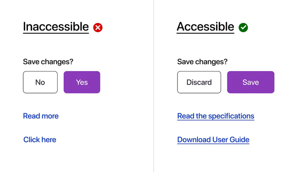
    Avoid vague link labels like "Click here," which can cause user confusion and impair navigation.

  2. Tiny Link Targets

    Tiny link targets violation example

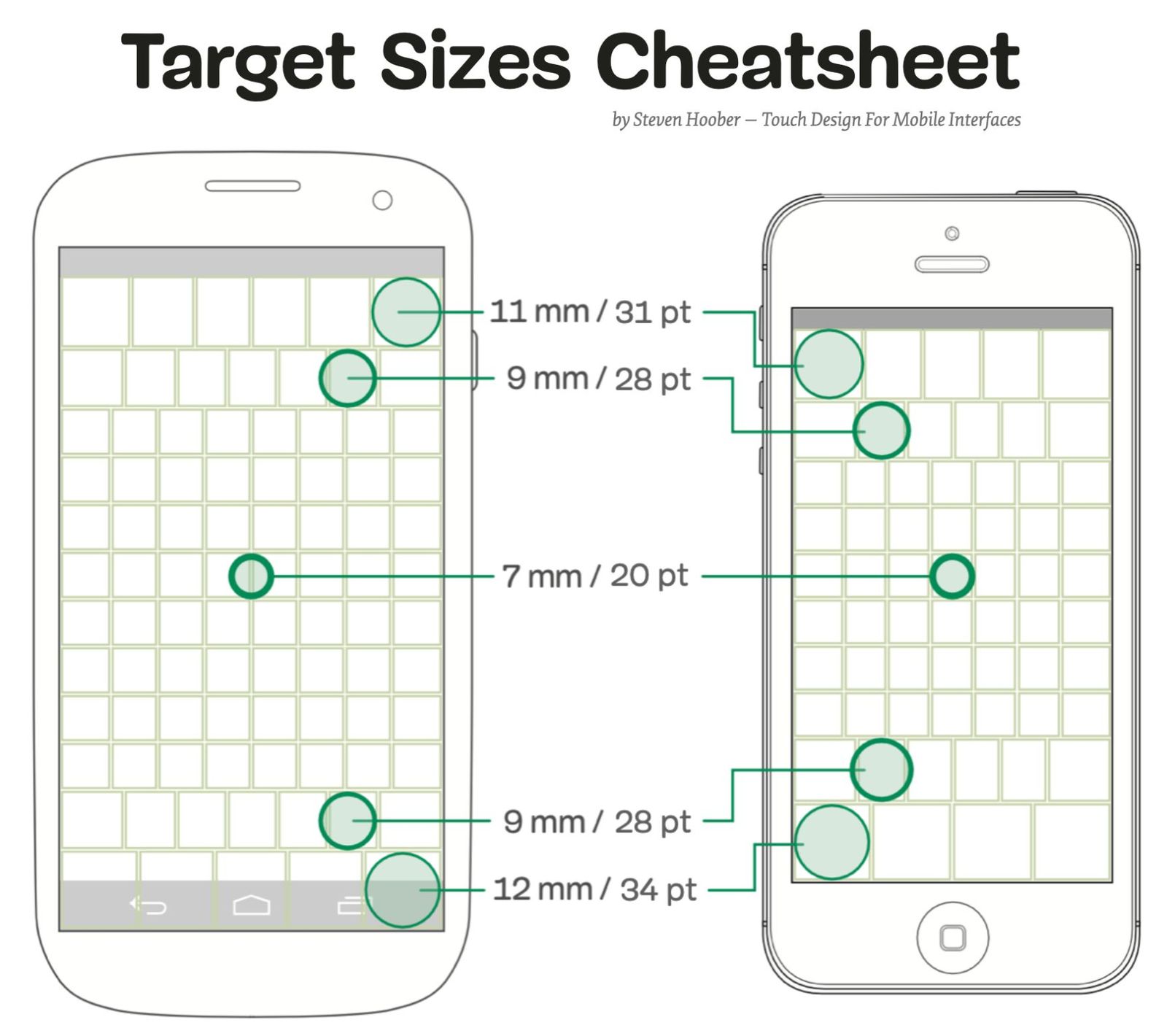
    Small click targets make navigation difficult, particularly on mobile devices. Ensure links and buttons are adequately sized for ease of use.

  3. Overcomplicated Interfaces

    Overcomplicated interface example

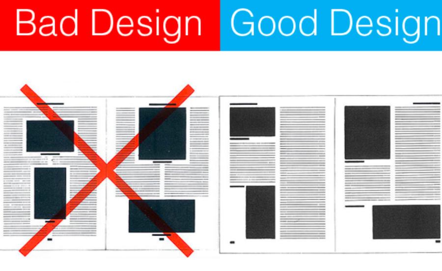
    Avoid adding unnecessary features that clutter the interface and confuse the user. Simplicity often leads to better usability.

  4. Confusing Navigation

    Confusing navigation structure example

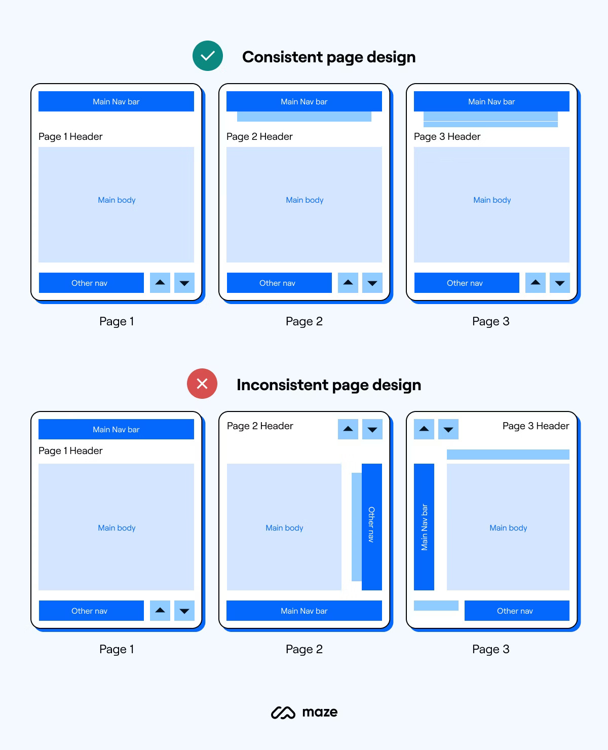
    Navigation should be intuitive and straightforward. Avoid complex or hidden navigation structures that can confuse users.

  5. Not Using Labels for Radio Buttons and Checkboxes

    Missing labels for form elements example

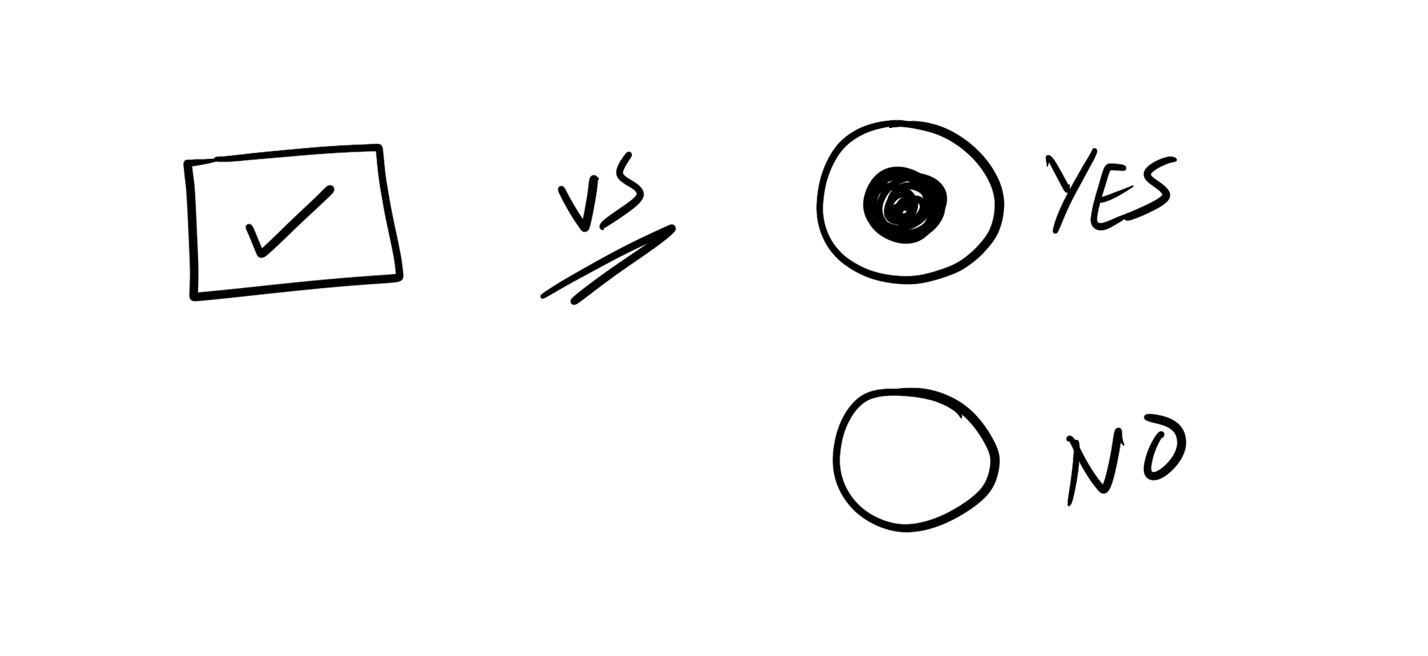
    Not using labels for radio buttons and checkboxes can lead to confusion for the user. Labels provide context and make it clear what option the user is selecting. Without labels, users may not understand what each checkbox or radio button represents, leading to potential mistakes in form submission.

  6. Unfactorable Interfaces

    Unfactorable interface example

    Evolving interfaces that lose coherence and become over-complicated. Unfactorable interfaces can lead to a frustrating user experience. It's important to design interfaces that can be broken down into smaller, manageable parts. This allows for easier understanding and navigation by the user.

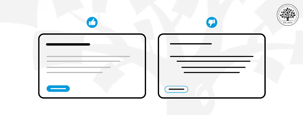
  7. Clickable or Non-clickable Confusion

    Clickable vs non-clickable confusion example

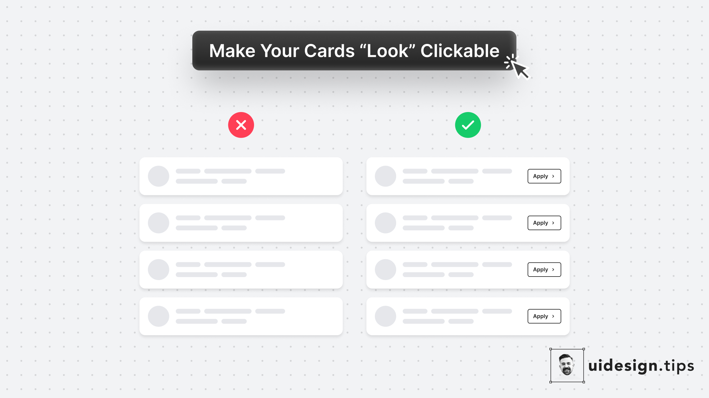
    Unclear interface elements that confuse users about what is clickable. It's important to make it clear to users which elements on a page are interactive. If users can't tell what is clickable, they may miss out on important features or information. Make sure to use standard visual cues for clickable elements, such as underlined text for links or button-like appearances for clickable items. Also, consider using hover effects to further indicate interactivity.

  8. Blanking the Forms

    Blanking forms issue example

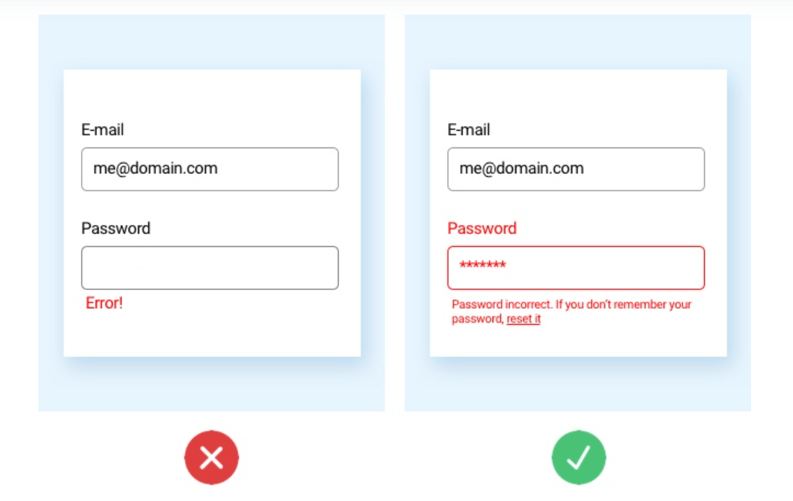
    Resetting forms completely when users make minor errors. This is a common issue where the form resets completely even when users make a minor mistake. This can be frustrating for users, especially if they have filled out a large portion of the form. It's important to design forms in a way that retains the information entered by the user even if they make a mistake. This way, they can simply correct the error and continue with the form submission, rather than having to start over from scratch.